
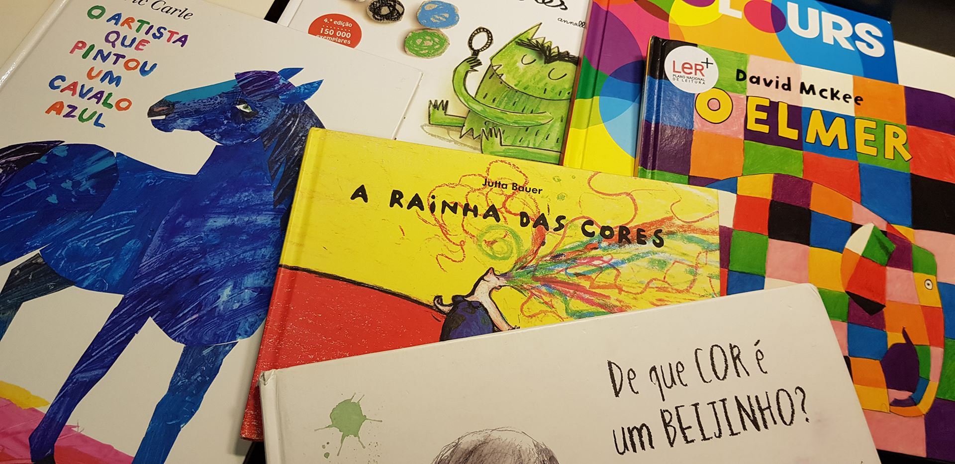
| 2019 INTERNATIONAL COLOUR DAY See how some of AIC member countries celebrated ICD. |
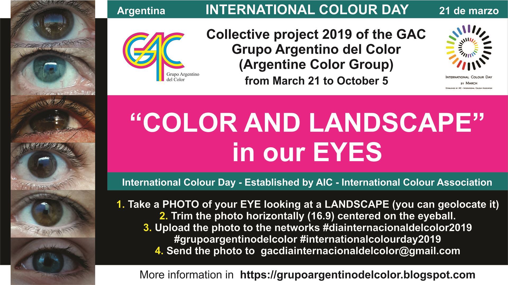
| ARGENTINA "Celebrations of the International Colour Day aim to develop awareness to the importance of colour phenomenon and culture in the broad domains of Art and Humanities, Science, and Technology, so we encourage every member country to get involved" (call ICD 2019 of the AIC). It is very important that all the AIC member countries celebrate the ICD for recognition by UNESCO: the AIC is preparing a report for a new candidacy after March. COLLECTIVE PROJECT 2019 OF THE GAC This project is based on the intention of recognizing ourselves in our DIVERSITY through a series of photos that combine a variety of COLORS of our eyes, the multiple LANDSCAPES that surround us,the plurality of looks on those landscapes, and the mixture that is generated in the superposition of the own and reflected colors, through a game between light, observer, environment, space, color and cesia. In addition, we want to address, in a different way, the theme "COLOR AND LANDSCAPE" of the next AIC 2019 congress that will take place from October 14 to 17 in the Autonomous City of Buenos Aires, Argentina. |
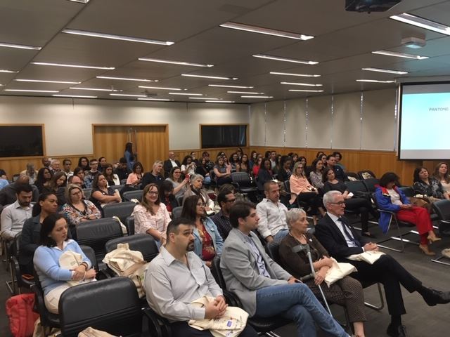
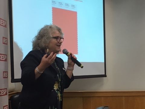
| BRAZIL On March 21 the International Colour Day was celebrated in an event held in an auditorium for 100 people, with the participation of paint manufacturers, color solution providers, architects, decorators, designers of interiors and specialists of the academic environment. Those present received an ecobag from the event, with sponsors’ materials. The event was sponsored by ProCor's affiliated companies: COLORMIX, LECHLER DO BRASIL SA, LUKSCOLOR PAINTS, RENNER SAYERLACK, SHERWIN WILLIAMS PAINTS and SINTEGLAS, which we honor very much! The event was supported by ProCor, ABA, ABEDESIGN, ABIHPEC, ABRAFATI, DESIGN | ESPM, FUTUREPRINT and SITIVESP. The opening ceremony of the event was honored by the President of the Painters and Varnishes Industry Union of the State of São Paulo (SITIVESP), Mr. Narciso Moreira Preto. Following the opening, ProCor's President, Prof. Dr. Paula Csillag, presented the entity and the commemoration of the International Day of Color. According to her, this type of event potentiates synergies and partnerships, promoting interaction between academia and industry. After the opening, there was the main lecture by PANTONE on "The Backstage of Color of the Year, Living Coral", given by the expert in Colors and Trends, Blanca Lliahnne. The company LECHLER offered a special gift to ProCor at this event, a wooden cube, painted with the color of the year Pantone! After the lecture, there was a presentation on ProCor's participation in AIC2018 in Lisbon, through the presence of Anamaria Rezende, who received financial assistance from ProCor for registration at AIC Lisboa. Following, in the Panel "Academic Communications on Color", Karolline Abuchaim, presented her research "Study on the Use of Colors in Hospital Environments". Following, in the panel on Projects of Associates, the member Edna Prado presented his work on handmade paintings. Following these, there was the Panel of Companies Sponsoring the Event. In this panel, each of the companies that sponsored the event, had 10 minutes to make a presentation telling news and trends offered by each company. In alphabetical order, representatives of the companies COLORMIX, LECHLER DO BRASIL S.A, LUKSCOLOR PAINTS, RENNER SAYERLACK, SHERWIN WILLIAMS PAINTS and SINTEGLAS made presentations. |
 | CANADA
Colour Research Society of Canada (CRSC) Celebrating International Colour Day CRSC Annual General Meeting 6 pm / Lecture by Artist Tania Love 7:00 pm Thursday, March 21, 2019 6:00 PM- 9:00 PM Interface Carpet Showroom Toronto, Ontario, Canada 134 Peter Street Suite 1602 https://www.interface.com/CA Colour Perspectives: Art practice through the lens of plant and mineral pigments Tania Love presented her reflections on the impact of colour, historical uses of colour, recipes and preparations as well as her personal research and explorations of plant and mineral based colour on paper and textiles. A Toronto based visual artist, Love is interested in the intersection between traditional methods and innovative expressions. She explores a breadth of materials including plant-based inks and dyes, milk paint, salvaged wire, paper and textiles. Her work has been seen in public and commercial galleries in her native Toronto and Ontario as well as abroad, in New York, France, Poland, India and Japan. Her upcoming solo exhibition, Pathways (Mississippi Valley Textile Museum in Almonte, Ontario, Canada, April 13-June 15, 2019), includes a site-specific installation of multiple kozo paper panels evoking a body of water, river patterns and topographical references. The exhibition contemplates the museum’s historical use as a textile mill, setting along the river and reshaping of the land through development. Drawing attention to the precious natural resource of flowing water that was instrumental in powering industrial growth, her work opens up reflection on our contemporary relationship with water. On the second floor gallery Love will present works created with plant-based inks and dyes. The relationship between the works in the two galleries will highlight aspects of colour history from the natural to synthetic as well as the intersection between the natural and industrial. |
| DENMARK In debates about colours and design, the main emphasis is often on fashion and colour trends. The Colour Days exhibition digs a little deeper in a strong professional field, driven by a profound curiosity about and respect for colours as beacons in our daily life. The exhibitors show us that colour is an element that we can shape, delve into and explore. Show us colours as something we can wonder about when we encounter them in the local supermarket, colours and shapes as part of an artistic practice, colours we can play with, experiment with and use to alter our surroundings with. ‘In Denmark we have so many great craft makers, designers and architects to whom colour plays a key role in their daily work. The designs that come from their hands and minds affect us all in our daily life, whether we think about it or not. That is why it’s so important to take an interest in colours and examine how colours are used in our surroundings. Not only as trends and fads but as a fundamental component in the way we understand and experience the world around us,’ says the curator of the Colour Days exhibition, Anders Petersen. The exhibition features fashion designer Mads Nørgaard, ceramicist Morten Løbner Espersen, colour and textile designer Margrethe Odgaard, the architect’s firm Vandkunsten, textile designer and textile printer Anne Fabricius Møller and artist and designer Eske Rex. With reflections and tangible products and objects from these six vantage points the exhibition offers an insight into design processes and inspiration for experiencing colours. |

| FINLAND The Finnish Colour Association (SVY) celebrated the International Colour Day by awarding the Iiris Prize 2019 to cinematographer and colour grader Pentti Keskimäki. The jury of the award wants to draw attention to the fact that the ever greater role of the colour grader as a creative author of the visual appearance of a film remains without due recognition. As a pioneer of his field in Finland, Pentti Keskimäki has worked persistently and productively for over two decades towards raising the visual quality of Finnish films closer to an international level. He has collaborated with cinematographers and other film professionals in order to highlight the potential of colour grading as part of the creative process of film making. Keskimäki’s professional portfolio includes over 80 film productions in which he has been involved as a cinematographer, colour grader or in other duties. Pentti Keskimäki has collaborated closely in carrying out various tests and educational events, has actively guided both young and experienced film makers and has forged an impressive career of his own as a colour grader. The Iiris certificate was handed over to Pentti Keskimäki at the Colour, colour - seminar on Saturday 6th April in the National Audiovisual Institute's cinema, Kino Regina. The seminar was organised by the National Audiovisual Institute and the Department of Film and Scenography of Aalto University. The seminar's themes were the significance of colour and the development of colour techniques in cinema. The Iiris Prize The Finnish Colour Association’s Iiris Prize is awarded annually on 21st March to a person or persons whose work or deed has created an outstanding colour experience or has noticeably improved the aesthetic appreciation, functionality or safety of people’s daily lives or environment. The work can involve fine art, design, architecture or environmental design or for example colour technologies such as photography, colorimetry or the printing process. |
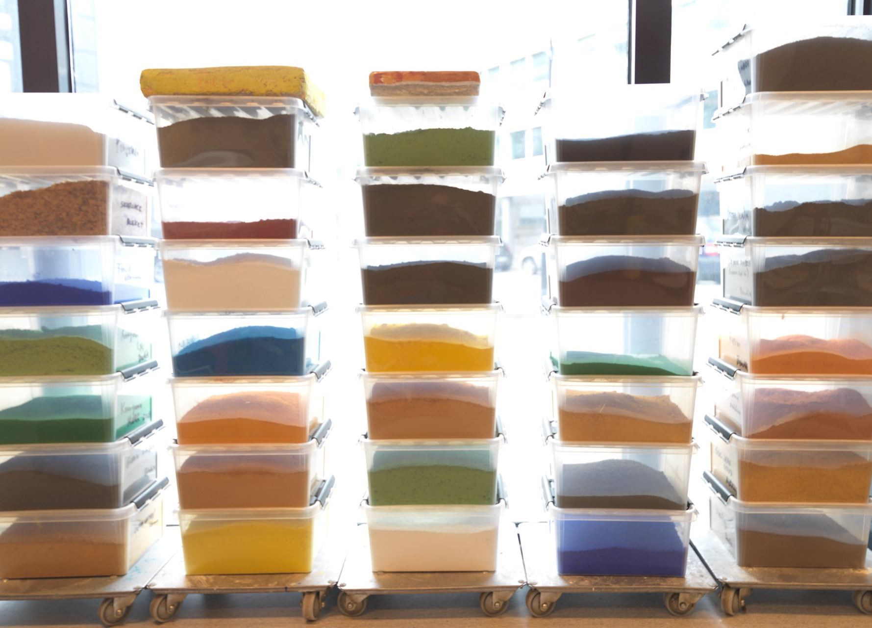
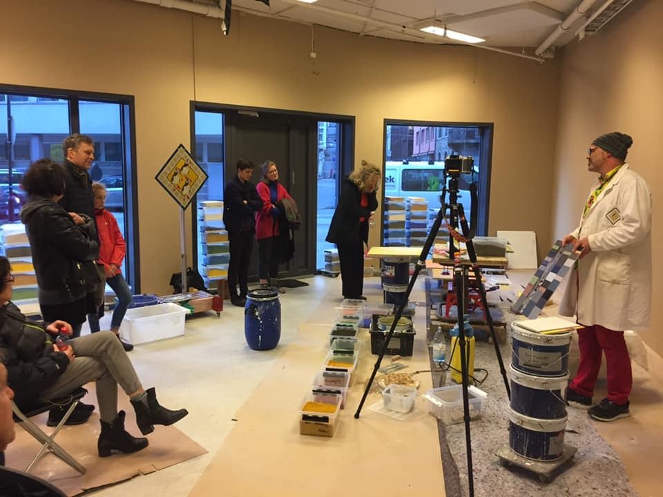
| FRANCE The Centre Français de la Couleur participated to the German initiative lead by the Museum of Colours in Berlin and disseminated the idea of a « No black clothes day » on march 21st. 2019 was declared by UNESCO « International year of the periodic table » so we decided to focus on that scientific topic. For these reasons the event was called « Éléments-Terre » and was lead in partnership with the Museum of Mineralogy at Ecole des Mines de Paris (Mines-ParisTech, PSL, University). A guided tour on the thema of « The native elements and their chromatic effects on minerals » was closing the event when sunset was facing the large windows of the Gallery. We then gathered natural colours and shapes views of minerals with the symbol of the sun light distribution over the whole world at that date ; it was only for knowledge and wonderment! A lot of scientific questions where evoked by the examples offered by minerals. The dialectic of Nature and Structure of minerals founded the main interrogations about natural colours. We know for a long time the importance of the nano-micro-meso-macro scales of structuration of materials, in the natural or industrial worlds. One can thinks that colour is mainly depending on structure (how organized is the material) than on nature (chemical composition). Humans manipulate the two! |
Illustration 1.Piece of Afghan Lapis Lazuli
| GREAT BRITAIN The Colour Group (GB) celebrated this year’s International Colour Day with a brief guided tour of the National Gallery. Our guide was the art historian, lecturer and artist Gayna Pelham. She explored how colours had been used by artists across the centuries and spoke about the use of colours and pigments and changes in the artistic palette as well as in subject matter. Some samples of raw materials, such as a number of semi-precious stones, generally used in jewelry, were examined by the participants (Illustration 1). The tour began in front of the San Pier Maggiore Altarpiece, by Jacopo di Cione and workshop, 1370-71 (Illustration 2), and continued by examining further the mastery of Cione in another of his works, owned by the National Gallery, The Crucifixion, 1369-70 (Illustration 3). Detailed examination of the collection continued with the analysis of the pictorial composition and the use of colours in the Annunciation, with St Emidius, by Carlo Criveli, 1486, The Ambassadors by Hans Holbein the Younger, 1533, and Titian’s Bacchus and Ariadne, 1520-3, and also explored also the light and fascinating details of the Arnolfini Portrait by Van Eyck, 1434. Discussion of the history, the artistic materials and the techniques involved in each picture was intermingled with an introduction to the story of the National Gallery, which helped the members to gain an understanding and appreciation of the significance of the collection. The audience being so absorbed by the presentation and the exhibits led to the tour exceeding the allotted time. There are already plans in place to continue the exploration. Next year members will explore the use of colour and light in the work of some of the most extraordinary Western European artists of the seventeenth century from El Greco to Caravaggio and Rembrandt to Rubens. |
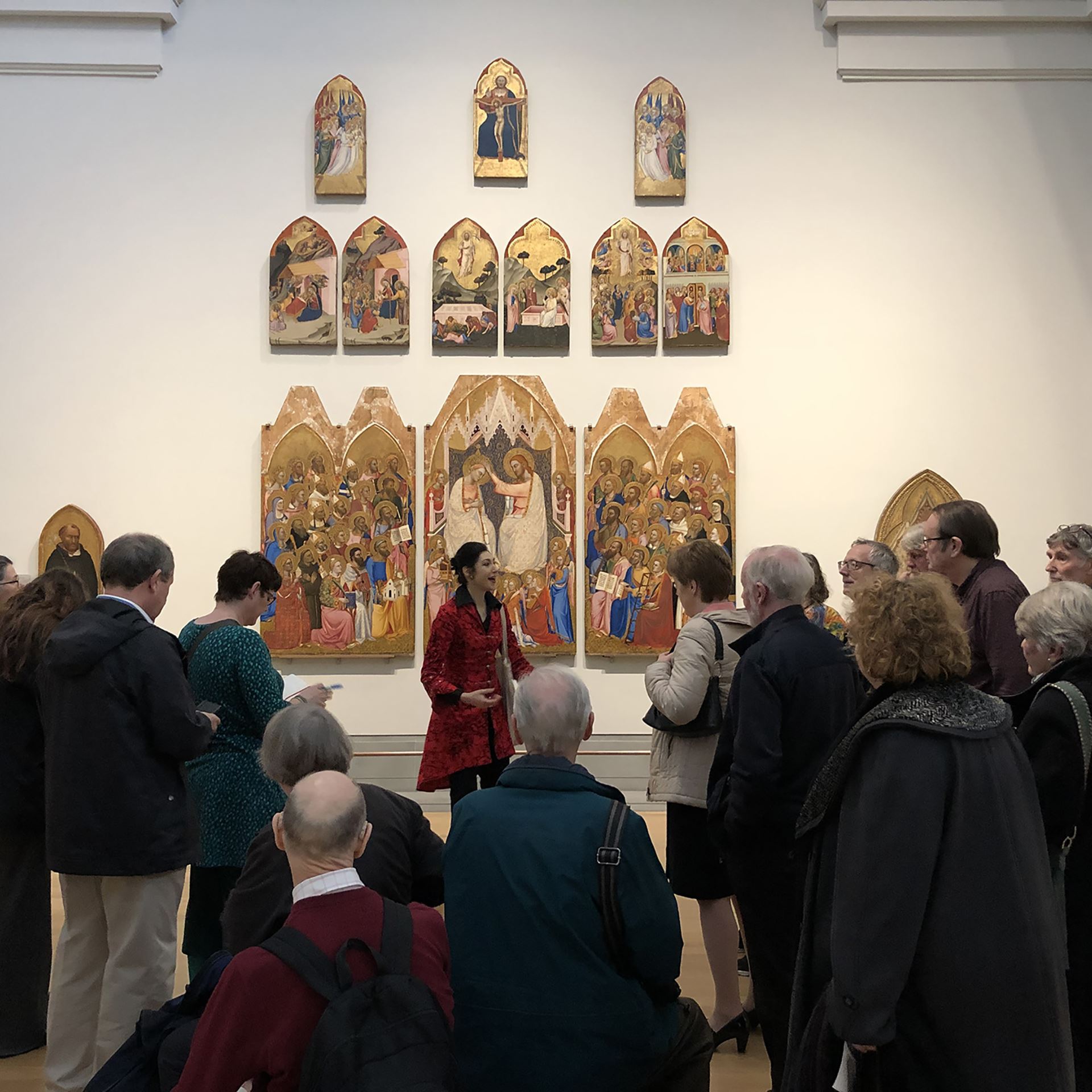 Illustration 2. San Pier Maggiore Altarpiece, by Jacopo di Cione and workshop, 1370-71, National Gallery, London, UK
 Illustration 3. The Crucifixion, by Jacopo di Cione, 1369-70, National Gallery, London, UK
| ITALY
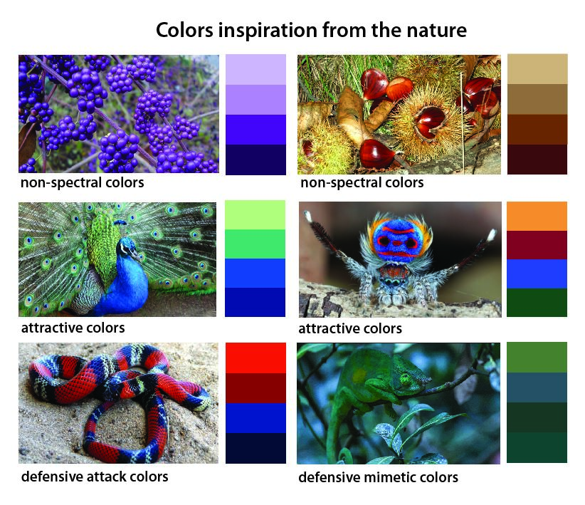
On 21 of March is in Italy the first day of Spring. So Lia Luzzatto and Renata Pompas, on the occasion of the 2019 International Color Day, celebrated this event focusing the students' attention on the chromatic language of nature, which show an inexhaustible collection of inspiration for their visual projects. The students were able to compare the "attractive function”, often with brilliant colors, and the “deterrent or defensive function", that minimize the differences with the environment, with the theory of chromatic contrasts. Color functions, which can be applied to product design. |
| JAPAN
The first celebration of the ‘International Colour Day’ in Japan was held in 21st, March, 2019, at Tokyo Polytechnic University. The event was hosted by the Color Science Association of Japan (CSAJ) and supported by 18 societies and associations relating to color. Seventy people, including twenty-five non-members of the CSAJ, participated in the event. After an inaugural address by Dr. Shin’ya Takahashi, the President of the CSAJ, and the presentation by Dr. Takahiko Horiuchi, EC member of the AIC, introducing a history of the ICD and various events having been held in other member countries of the AIC, special lectures and a panel discussion entitled ‘The era of color universal design coming!’ was held. First, Dr. Shoji Sunaga at Kyushu University gave a lecture ‘Basics of the color universal design,’ in which he explained physiological mechanisms yielding the variety of our color vision. Next, Dr. Yasuyo Ichihara at Kogakuin University gave a lecture ‘Practice of the color universal design,’ in which she introduced her own work of realizing color universal design on the maps in a textbook of history. Finally, a panel discussion among two lecturers and floor participants was held, presided by Dr. Kazuyuki Natori, the Vice President of the CSAJ. There was a lively discussion about proper names for the variety of color vision, a compatibility between color universal design and designability for people with major color vision type, an importance of spreading the color universal design over the world, and so on. After spending four hours, the historical event for the CSAJ was over with a great success. We hope to plan more experiential event in the ICD next year. |
| THE NETHERLANDS On 21 March ‘Stichting Kleurenvisie’ , the Dutch foundation for Colour, celebrated the International Colour Day in the building of Circl, a circular hotspot in Amsterdam. New members of the board were colour-pitching and each of them had invited a expert for a lecture about colour and/or circularity. All involved were pleased to see each other again in the well-attended meeting. It was also a moment of official parting by one of the board members, Jan de Vletter, who had attended for over 20 years, first at “Kleur -Buiten” that had become part of SKV about five years ago. He was and is still very active for the preservation of the “Regenboogbuurt” in Almere, a neighbourhood designed with colour as a starting-point. The moderator of the day was Clairette Gitz, architect/owner of Gitzarchitecten, publicist and guest-researcher (PhD) at the University of Delft, Faculty of Architecture. Ir. Pi de Bruijn, Architect, Founding partner of Architekten Cie, Amsterdam chairman and architect of Circl welcomed the audience together with Kim van Savooyen, interior-colour designer and executive director of the foundation. Speakers of the pitches and lectures:
|

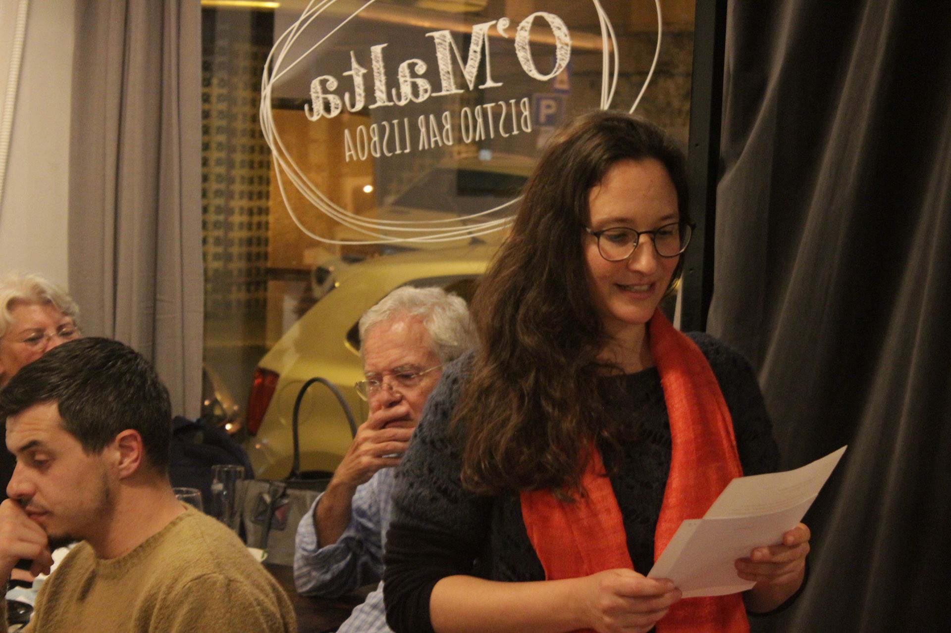
| PORTUGAL The Associação Portuguesa da Cor (Portuguese Colour Association) celebrated the International Colour Day and the World Poetry Day on the 21st March 2019 with an International Poetry Reading Encounter dedicated to Colour entitled “Não podemos mais viver sem poesia, cor, amor/ We can no longer live without poetry, colour, love” in a joint collaboration with CEC – Centre for Comparative Studies, The Colour and Light Research Group, CIAUD – Research Centre in Architecture, Urban Planning and Design (both at University of Lisbon). The lively celebration was held at O'Malta Bistro Bar in Lisbon, starting at 6.30pm and ending after midnight: 6 hours of colour poetry shared with 55 people. Colour poems that were sent from India to Chile by 16 interested people were also read out and will feature in the compilation of poetry on colour that is being prepared for publication. This year the ICD celebrations included activities for children and families as well. In a collaboration between the Associação Portuguesa da Cor and Roda – Movimento Social pela Natureza e pela Arte https://www.facebook.com/roda.movimento.social two events took place at Marvila Library in Lisbon, on 23rd March, from 15.30 to 17.30. Children and their families were invited to ‘dream in colour’ during a film session ‘Little films are a rainbow’ aimed involving the children in the joy of discovering the colours featured in the little films. The workshop ‘What are the colours of your emotions’ for 3 to 10 year old children followed the film session. During the workshop, children explored relationships between emotions, words and sounds in a very creative atmosphere. |
.jpg)
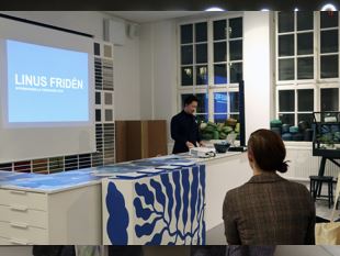
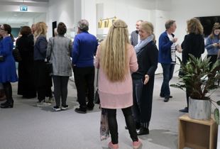
| SWEDEN A celebration to the blue colour! This year we celebrated the international Colour Day on March 21st with almost 50 participants. Ogeborg, producer of textile carpets, welcomed us all in their showroom which for the day was decorated in blue carpets and textiles. We started the celebration with two interesting lectures and ended the evening with good food. ” What was the true colour of #the Dress?” On the first talk on the International Colour Day, we could listen to the discussions and conclusions about "dressgate": the color phenomenon that aroused on the social media: What colour actually had #The Dress and what factors are playing on digital colour images? Was the dress blue and black or white and gold? Bodil Karlsson, PhD of Psychology, Department of Psychology, University of Gothenburg has done research to explain the colors of the dress. We could also take part of Bodil’s own research on how we perceive the colours of the dress and why. Bodil could unfortunately not attend this meeting so the talk was presented by Johanna Ärlemalm. The Blue Colour was the theme of Awarded Colour 2018 Traditionally the celebration of the International Colour Day also includes a lecture by the prize-winner of the Awarded Colour, which is a competition in colour design for students and graduates in design, architecture, visual communication and art. The theme of 2018 was “The Blue Colour” and the task was to create a colour design inspired by the blue colour. The Award ceremony was held in connection with the Stockholm Furniture & Light Fair, Greenhouse, 5 February, 2019. Linus Fridén University of Arts, Crafts and Design, Stockholm was awarded 1st prize for his proposal BLÅ (blo:). Linus presented this winning contribution "Blå" (Blue) during this ICD. His contribution takes the viewer out on a journey in a blue world. |
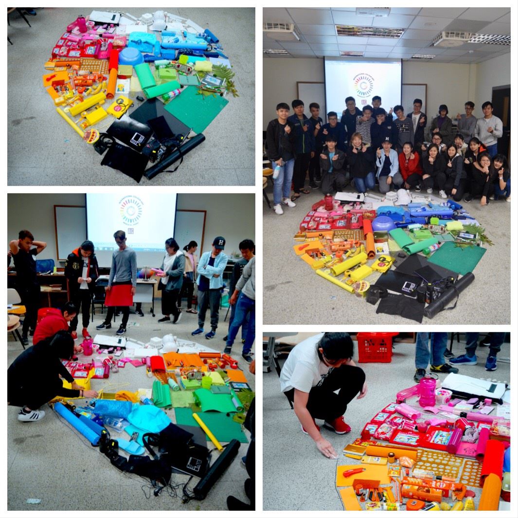
| TAIWAN
The Color Association of Taiwan (CAT) celebrated the International Colour Day at several events, including (1) Arts and Humanities course directed by Mr. Zhiwei Chen at Zhongshan Elementary School in Taoyuan city, Taiwan, (2) the practice of “Color Imagery” at School of Environmental Design in the Cultural University, (3) the meeting of Industry Professional Assessment System held by Industry Development Bureau, Ministry of Economic Affairs. In the Arts and Humanities course, Mr. Zhiwei Chen taught the elementary school students how to use a single color to draw the 3D effect and how similar colors and contrasting colors create a clock face that is similar to color blindness. In the practice of “Color Imagery”, nearly 130 students from different departments crossed 6 nationalities collected natural and artificial colors from daily life, observe each color and feel it. The meeting of Industry Professional Assessment System was held at the National Taiwan University of Science and Technology and was attended by about 60 people. The talk was started from Raymond Wong from the HP Taiwan. It was followed by four more talks with topics ranging from the fields of Branding and Design (MSI), Printing technology (SUNSUI Print and Printing Technology Research Institute), Textile technology (Taiwan Textile Research Institute). The talks and presentations touched off many lively discussions, extending further the celebration of the enthusiasm for color. |
| NORWAY "Color. A visual History " in her talk "Pigments of the imagination – A Visual History of Color” at Oslo Academy of the Arts. The secret history of color: «If you want to understand society, look at the way it talks about hue, suggests a new tome from art historian Alexandra Loske» https://www.fastcompany.com/90310951/the-secret-history-of-color 110 people attended the event |